
How I built a system-first creative brand designed for clarity, connection, and measurable results

A bold brand built on connection, color, and clarity: the visual identity of Hooked Media.
The Idea
Hooked Media was created to capture attention and turn it into growth. The brand identity reflects bold creativity, systems thinking, and a playful edge that makes it both memorable and approachable.
Hooked Media was built for brands that want to do more than get noticed. It's for those who want to build trust, connection, and community through clarity and storytelling that performs. The tagline says it plainly: Hooked on Content. Addictive by Design.

Visual identity
Hooked Media's identity was designed to be instantly recognizable in motion, print, or feed. It uses structure as its foundation, energy as its personality, and simplicity as its system.
Color Palette
The color palette is internet-native by design. Every color is named after a digital state or user behavior, because the brand lives where attention does: in feeds, notifications, and scroll sessions.

Concept
Every strong brand is a chain of connected ideas. The Hooked logo represents those connections; creativity, systems, and analysis all linked together to form a complete ecosystem.
Each link is intentional. Together they symbolize balance: between left-brain logic and right-brain creativity, between art and analytics, between connection and conversion.
Even the colors carry the idea; each one is named for a moment in the attention economy: getting verified, getting noticed, taking the spotlight, and getting paid.

Hooked Media is the link between creative storytelling and measurable growth.
The palette runs on a deliberate ratio: Verified leads at roughly 30%, System supports at 25%, and Notification, Spotlight, and Refresh each take about 15%. Color shows up as sharp accent hits on clean, near-white backgrounds; never as wall-to-wall fills.
The colors are vibrant but deliberate, creating an ecosystem that feels both engineered and joyful.
Typography
Typography reinforces Hooked Media's balance between human and system. The pairing of Chillax Bold and Google Sans creates a confident, legible structure that works seamlessly across social, brand decks, and product design.
Chillax Bold: for strength and personality in headlines.
Google Sans: for clarity and accessibility in body copy.
The hierarchy is disciplined: left-aligned always, never justified, with a minimum 4.5:1 contrast ratio when type sits over color or imagery. The type behaves like the brand does; bold where it counts, clean everywhere else.

Logo and Symbol
The Hooked logo combines the bold simplicity of a wordmark with the symbolism of the chain link.
The link itself is the brand — a visual metaphor for connection, collaboration, and consistency.
It feels dynamic, familiar, and scalable, whether it’s embossed on packaging, animated in motion graphics, or printed on a t-shirt.
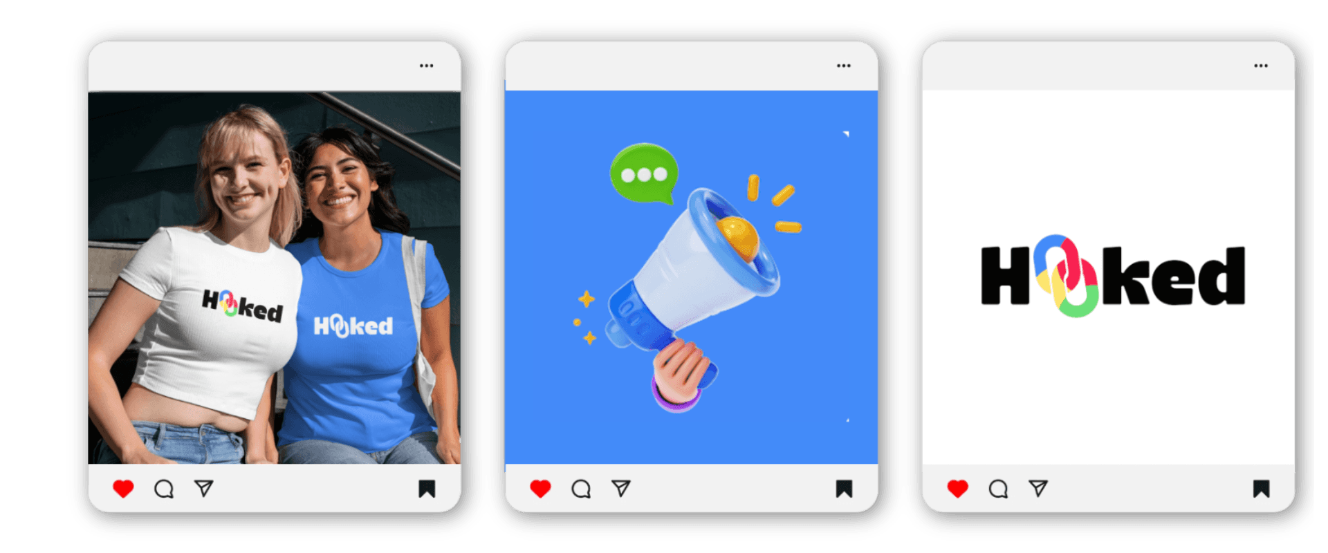
The Brand in Action
Hooked’s design system is built for adaptability.
Every element was created to function cohesively across mediums, from motion graphics to merch to mobile.
You can recognize Hooked in a color block, a sentence, or a scroll stop.
That’s by design — the system is meant to scale effortlessly and feel unmistakable no matter where it lives.

Tone and Personality
Hooked’s personality is grounded in duality:
Analytical yet approachable
Professional yet playful
Creative yet structured
It’s a brand that speaks like a strategist but feels like a friend.
Every word, design, and piece of content is meant to make people think, smile, and stay a little longer.
Strategy Behind the Aesthetic
Hooked was designed with data and purpose.
Before finalizing the visuals, I reviewed audience feedback, past campaign performance, and client messaging data to ensure every design choice aligned with measurable outcomes.
The brand performs because it was built like a system — intentional, scalable, and easy to apply consistently.
Results
Since launching Hooked Media, I’ve seen growth that validated every design and strategy decision:
185% increase in revenue
450K monthly views
9% engagement rate
78% client satisfaction
Hooked doesn’t just look the part. It delivers results that prove creativity and clarity can coexist and convert.
Reflection
Hooked became the creative system I wish I had when I started.
It’s proof that strategy doesn’t limit creativity — it amplifies it.
This rebrand wasn’t about chasing trends. It was about building trust through systems, story, and scalability.
That’s what makes Hooked work.
